

How to Mix Vintage Patterns: A Design Guide
Posted by Editorial Team on Oct 14th 2026
Table of Contents
- Start With Your Favorite Piece
- Pattern Mixing Rules for Interior Design
- Mixing Vintage and Modern Decor
- Mixing Floral and Geometric Patterns
- How to Layer Patterns in a Room
- Avoid These Common Pattern Mixing Mistakes
- Room-by-Room Pattern Mixing Examples
- Frequently Asked Questions
Last Updated: October 13, 2026
Start With Your Favorite Piece
To mix vintage patterns effectively, start simply: pick one piece you genuinely love. This becomes your anchor.
That favorite piece might be a vintage rug with bold florals. Or a set of patterned curtains.
Why start here? Because the piece you love already contains colors and a mood. Those colors guide your next choices.
At thomaspaul, we see this approach work repeatedly.
Your anchor piece does the heavy lifting. It sets the tone. Everything else follows its lead.
Pattern Mixing Rules for Interior Design
When you mix vintage patterns, success comes down to a few core principles. These rules keep your space from feeling chaotic or overwhelming.
Match Pattern Scale to Room Size
Scale matters more than most people realize. A large-scale pattern in a small room feels cramped.
Here's the practical rule: match pattern size to your room's actual dimensions.
Large rooms can handle bold, large-scale patterns. Think oversized floral prints or big geometric shapes. These patterns have breathing room.
Small rooms need smaller-scale patterns. Delicate florals, fine stripes, and tight checks work better. They don't overwhelm the space.
Medium rooms? You have flexibility. Mix one large-scale pattern with 2-3 smaller ones. This creates depth without chaos.
Repeat Your Color Palette Across Patterns
The secret to cohesion is color repetition. Pick 3-4 colors from your anchor piece. Then find those same colors in every other pattern you add.
This simple rule transforms chaos into harmony.
Repetition creates visual flow. Your eye moves naturally from one pattern to the next because the colors guide you.
A cohesive color palette is what separates "I intentionally mixed these patterns" from "I threw things together." The patterns don't have to match. The colors do.
Mixing Vintage and Modern Decor
Most guides tell you to balance vintage with modern. Few explain how to actually read a vintage pattern's era so you can pair it without creating a time capsule or a clash. That's the gap this section fills.
Read the Era Before You Pair
Every vintage pattern carries era signals. Learn to spot them and you'll know what it will and won't play well with.
- Victorian and Edwardian (roughly 1837-1910): dense, all-over florals, damasks, toile, chintz, cabbage roses. Colors lean deep, burgundy, forest green, navy, gold. Motifs are organic and tightly packed.
- Art Deco (roughly 1920-1939): fans, sunbursts, chevrons, stepped geometrics, stylized florals. High contrast, often black with metallic or jewel tones. Motifs are structured and symmetrical.
- Mid-century modern (roughly 1945-1969): atomic dots, boomerangs, abstract organic shapes, small-scale geometrics. Palette is warmer, mustard, olive, rust, teal.
- 1970s: oversized florals, paisley, earth tones, browns and oranges, blocky geometrics.
- 1980s and 1990s: pastel geometrics, abstract squiggles, chintz revival, and later, muted florals.
Pairing Rules by Era
A simple principle: pair across eras when the structure of the motifs differs, and stay within an era when the scale differs.
- Traditional floral + mid-century geometric. This is the workhorse pairing. The organic floral softens the hard-edged geometric, and the geometric keeps the floral from feeling fussy. Anchor with the floral (usually larger), then add the geometric at roughly half the scale.
- Art Deco + contemporary minimal. Deco's symmetry reads as graphic and modern, so it sits comfortably next to clean-lined contemporary pieces. Keep the contemporary pieces solid so the Deco pattern stays the star.
- Victorian + 1970s. This is the pairing most likely to fail. Both eras use dense, saturated, all-over patterns, so they compete for the same visual job. If you want to try it, keep one piece small (a single pillow, a small framed textile) and let the other dominate.
- Mid-century + 1990s pastel. Works when you bridge them with a shared neutral. The warm mid-century palette and the cool pastels need a cream, tan, or warm gray to sit between them.
The Modern Side Does the Quiet Work
Contemporary pieces earn their place by being visually quiet. Solid upholstery, plain wood or metal frames, simple lamps, and unpatterned walls give vintage patterns room to breathe. A common pattern is to let one vintage textile carry the room's pattern load, then use modern solids everywhere else.
When to Break the Rules
Era rules are a starting point, not a cage. The pairings that feel most personal often break them deliberately, a Deco fan print next to a Victorian floral, held together by a shared navy. What makes it work is that the shared color does the connecting, so the era contrast reads as intentional rather than accidental. If you can name the color that ties two eras together, you can usually get away with the pairing.
Mixing Floral and Geometric Patterns
Florals and geometric patterns seem like opposites. One is organic. One is structured.
Pair a large-scale floral with a small-scale geometric. Or a delicate floral with a bold geometric stripe. The size difference prevents them from competing.
Color is your connector. If both patterns share navy and cream, they feel intentional together. Without that color link, they just look random.
Florals bring softness. Geometrics bring order. Together, they create visual interest. The space feels designed, not accidental.
How to Layer Patterns in a Room
Layering is how you build depth. One pattern alone feels flat. Multiple patterns, done right, create dimension and personality.
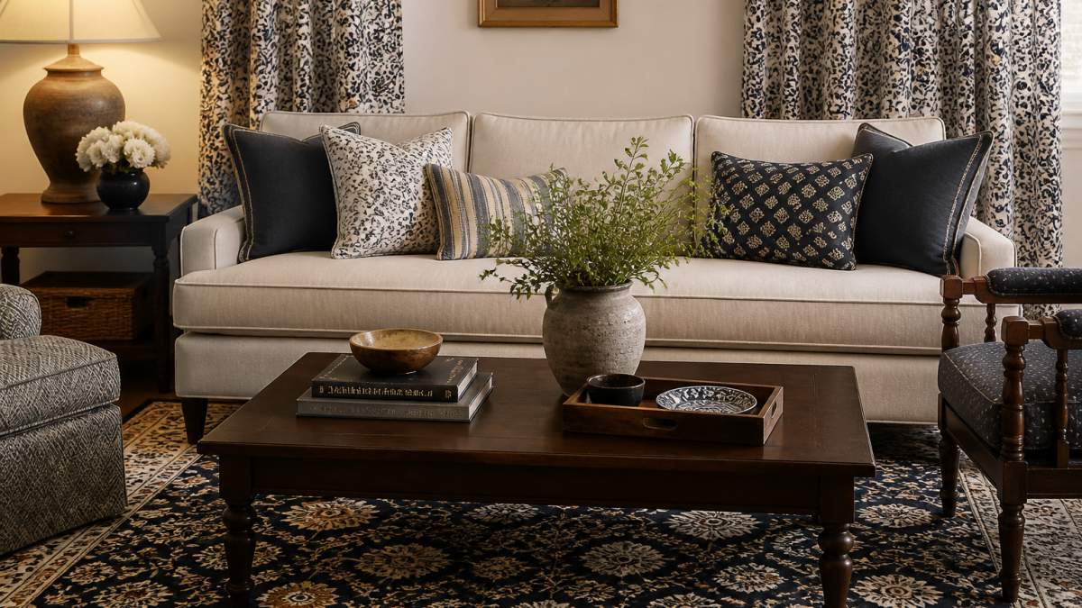
The Anchor Piece Method
Start with your anchor piece. This is your largest patterned item. Usually a rug, wallpaper, or large curtain panel.
From there, add layers. Add throw pillows in complementary patterns. Layer a patterned throw blanket over your sofa.
Each layer should be smaller than the last. Your rug is biggest. Pillows are medium. Smaller accessories are smallest. This creates visual hierarchy.
The layers should share your color palette. But the patterns can differ. A floral rug, striped pillows, and geometric curtains work together if the colors repeat.
Building Visual Balance With Solid Colors
Solid colors are your secret weapon. They prevent pattern overload. They give your eye a place to rest.
Use solid colors strategically:
- Furniture frames (solid sofa, solid chairs)
- Wall paint (solid, neutral background)
- Large accessories (solid throw blanket, solid lampshade)
- Negative space (empty wall, bare shelf)
For every patterned element, include a solid one nearby. Patterned pillow next to a solid pillow. Patterned curtain paired with solid wall. This balance keeps the space feeling intentional, not chaotic.
Solid colors also let your patterns breathe. They're the pause in your visual rhythm. Without them, pattern fatigue sets in. The space feels busy instead of interesting.
Avoid These Common Pattern Mixing Mistakes
Generic pattern-mixing advice warns you about scale and color. Vintage patterns fail in specific, predictable ways that general guides don't address. Here are the ones to watch for, with the fix for each.
Two Competing Focal Points
What it looks like: A bold vintage rug and a bold vintage wallpaper in the same room. Your eye can't decide where to land, so the space feels restless.
The fix: Demote one. Keep the rug as the anchor and swap the wallpaper for a solid or a very quiet texture, or vice versa. Only one element should be the loudest thing in the room.
Too Many Small-Scale Prints
What it looks like: A calico pillow, a small-check curtain, a tiny floral throw, and a ditsy-print lampshade. Nothing is large enough to anchor, so the room reads as visual static.
The fix: Introduce one large-scale pattern to give the small prints something to sit against. A large floral or an oversized geometric at roughly two to three times the size of the smallest print will organize the group.
A Clashing Palette
What it looks like: A vintage rug in warm rust and gold next to a vintage textile in cool blue and gray. Each piece is fine alone; together they feel off.
The fix: Find the one color both pieces share, often a neutral like cream or tan, and pull it forward through a solid element (a throw, a wall, a piece of furniture) placed between them. If there's no shared color at all, one piece has to go.
Faded Vintage Reading as Dull
What it looks like: A sun-faded vintage rug next to crisp new upholstery. The vintage piece looks tired rather than characterful.
The fix: Pair faded vintage with other faded or matte textures, not with high-saturation new pieces. Faded vintage reads best next to natural fibers, matte finishes, and other pieces with a little age. If you want it next to new, choose new pieces in muted or neutral tones.
Mixing Eras Without a Connector
What it looks like: A Victorian floral, a mid-century geometric, and a 1970s paisley, with nothing tying them together.
The fix: Pick one connector, a shared color, a shared neutral background, or a shared motif family, and make sure every pattern in the room carries it. Without a connector, three eras read as three unrelated rooms.
Overloading One Surface
What it looks like: Five patterned pillows stacked on one sofa, or a patterned rug, patterned curtains, and patterned upholstery all within arm's reach.
The fix: Spread patterns across the room instead of clustering them. Give each pattern its own zone, and let solid surfaces separate them.
A Quick Diagnostic Checklist
Before you commit to a combination, run through this:
- Is there exactly one dominant pattern, or are two competing?
- Do all patterns share at least one color or neutral?
- Is there a clear size difference between the largest and smallest pattern?
- Is there at least one solid surface between each pair of patterns?
- Do the eras have a connector, or are they just coexisting?
If you can answer yes to all five, the combination will usually hold together. If you can't, the answer is almost always to remove one pattern or add one solid, not to add more.
Room-by-Room Pattern Mixing Examples
Different rooms call for different approaches.
Living Room: Start with a patterned area rug.
Bedroom: Use patterned bedding as your anchor. Keep the headboard and walls neutral.
Kitchen: Patterned textiles work in kitchens through tea towels, curtains, and small rugs.
Nursery: Soft, smaller-scale patterns work best. A patterned rug, patterned curtains, and patterned crib bedding.
Bathroom: Patterned towels, a patterned bath mat, and patterned shower curtain can work together.
Mixing vintage patterns transforms a space from generic to personal.
thomaspaul's handmade textiles and designer decor make this easier.
Frequently Asked Questions
What is the 70/30 rule in mixing vintage patterns?
The 70/30 rule suggests that 70% of your space should be calm and neutral, while 30% can feature bold patterns and visual interest. This prevents a room from feeling overwhelming. Apply this by using solid-colored furniture, neutral walls, or quiet textiles as your foundation, then introduce vintage patterns through pillows, rugs, artwork, and accessories. This balance keeps the eye comfortable while allowing your patterned pieces to stand out.
How do you mix vintage patterns without making a room feel busy?
Use a cohesive color palette across all patterns, repeat the same 2-3 colors in each print you layer. Separate bold patterns with solid-colored elements like neutral upholstery or wood finishes. Vary pattern scale so large-scale florals pair with small-scale checks or stripes. Limit yourself to 3-4 patterns maximum in one room, and let one anchor piece dominate while others play supporting roles. This creates visual interest without chaos.
Can you mix floral, geometric, and striped patterns in one space?
Yes, but use a unifying strategy. Start with one dominant pattern, say, a large-scale floral on curtains, then add a geometric print in a complementary color on throw pillows, and introduce stripes in a smaller dose on a lampshade or accent textile. The key is ensuring all three patterns share at least two colors from your palette. Structured patterns like geometrics and stripes balance organic patterns like florals, creating cohesion rather than conflict.
How do you choose colors when mixing vintage prints?
Select a primary color palette of 2-3 colors that appear in your favorite vintage piece, then intentionally repeat those same colors in every additional pattern you add. If your anchor piece features navy, cream, and coral, choose floral prints, stripes, and checks that incorporate at least two of those colors. This repetition ties disparate patterns together visually. Avoid introducing entirely new colors in each pattern, which fragments the room's cohesion.